The reconciliation of surface and solid form
I will begin my blog series on favorite artists with Cezanne because, on balance, he is my #1 favorite. Really being turned on by his work is probably the main underlying reason for my soul’s choice, but there is another: Cezanne set out to pursue the single most difficult, most inherently contradictory, enterprise available to an artist working in two dimensions. Cezanne determined that he would give full value to the solidity of the world, while simultaneously fully acknowledging the reality of the surface as surface. Because the two understandings – the acknowledgment of the painting surface and the illusion of form in space – are perceptually incompatible, Cezanne creates an irreconcilable tension by insisting on both.
Cezanne was a key member of the post-impressionist era: those artists of the next generation who chose not simply to continue adding to the impressionist legacy (as many did) but rather to address what had been lost in the impressionist enterprise. The impressionism of Monet and his followers was a fantastically fertile undertaking but also a narrow one, concentrating on the unmediated perceptual world. Van Gogh worked to redress the loss of overt emotional content, of expressive purpose. Cezanne, on the other hand, worked to restore the traditional description of a world of solid form in space.
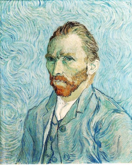
We can begin by comparing self-portraits by these two artists, to highlight the difference in their interests. Van Gogh did many self-portraits, all revealing his intense interest in his own inner life. Though beholden to the impressionists for his bright palette and spontaneity, we see immediately that the focus and paint handling are uniquely his own. The eyes totally rivet the viewer’s attention in a disturbing, overtly personal way, while the swirling strokes writhe across the surface of the canvas, denying space.
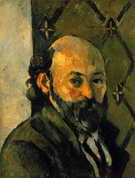
In the Cezanne self portrait, the effect is totally different. First, we learn nothing about him as a person; he is merely looking back at the viewer without comment. Second, the strokes are entirely different: square-ended and “architectural” , they sculpt the face into something solid and substantial. But even as he convinces us of the solidity of the head, he denies the space for the head to exist in. If we try (vicariously) to reach around the scull, our hand is stopped by the equally dense paint, forbidding entry and denying space behind the surface.
I love the tension of aggressively solid form fighting for implied space, and aggressively flat surface, denying it!
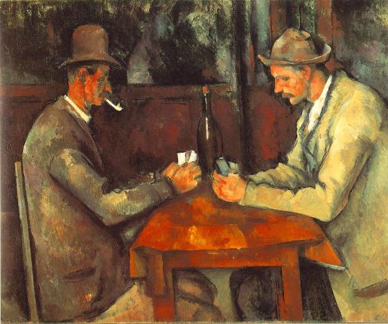
The “Card Players” is another excellent example of Cezanne’s approach. Again, there is no psychological content to speak of. Again, we believe in the substantial solidity of the people, the table, the chairs. And again our assumption of deep space is frustrated, not just through brushwork, but through a set of subtle devices you may not be immediately aware of.
First, the heavy outlines around the solid forms transforms them into borders between two areas of paint, rather than edges. Second, forms that should be at different depths in the space are locked together by lines. The head on our right is locked in by lines which are tangent to his hat on both sides. The cork at the top of the bottle forms a “T” with the wainscoting “behind” it. The result is a web of connections on the surface which frustrate the illusion of space.
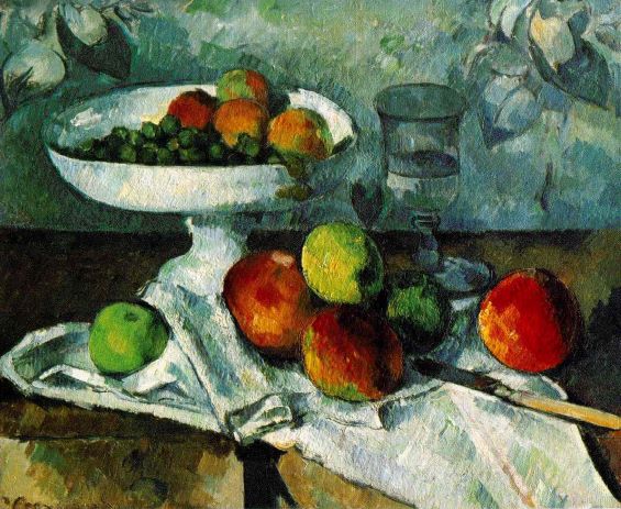
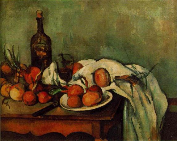
Cezanne did many still lives throughout his life. We can speculate that they gave him control over the composition which allowed him to ratchet up the tension between solid form and surface to new levels. In the two examples I show here, I challenge you to identify the many devices he uses to prevent empty space from surrounding the objects in the still life. There are many of them.
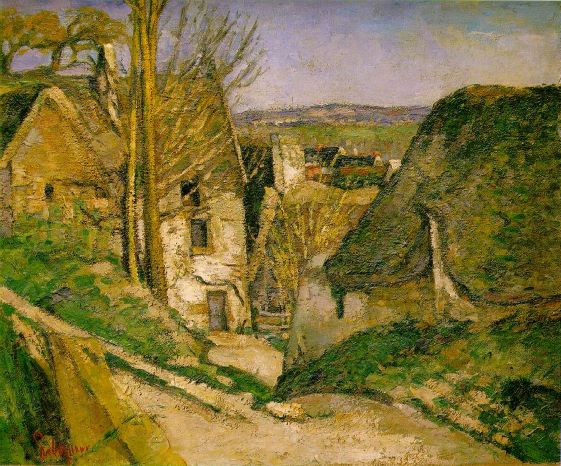
I will end with two landscapes, another favorite Cezanne subject. One is an earlier work, “the House of the Hanged Man”, and the color palette owes more to his traditional roots than to the new impressionist rainbow colors. A photograph of the scene would show you a road leading from the foreground, past the house and into the middle distance, a device used for generations to lead the viewer into the described space of the landscape. Here, however, the road becomes a wall! There is no way into this space for the viewer, and no space to be in if there were.
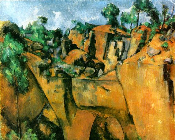
“Quarry at Bibiemus” is a frontal look at a rock wall, thus nothing the viewer is tempted to enter. What is remarkable here is that we can’t look across a foreground space to a wall of rock in middle distance, because we cannot push the rock wall back from the surface. The strong lines which bound the areas of strong color are surface lines, and furthermore, are locked into the frame. At the same time, the rocks themselves are described as massive and solid, demanding space to exist.
By report, Cezanne destroyed the majority of his works, totally dissatisfied with how far they fell short of his goal. What a loss! This is not surprising when what you are trying to do is inherently contradictory.
The Monson Arts Council is a 501(c)3 non-profit organization whose mission is “To discover, promote and sustain an appreciation of and an involvement in art and culture in Monson.” It is run by a volunteer Board of Directors who serve three year terms, and who each year elect a slate of officers for the coming year.
Monson Arts Council
PO Box 306
Monson, MA 01057
©2026 Monson Arts Council
Privacy Policy
Thank you for this very interesting look at Cezanne!
Cezanne’s work is now viewed differently by me.
He handles foreground objects with form and solidity. And then there is this tension, observed in his flattening of his backgrounds. Never understood Cezanne’s approach before.
A new respect for this artist. TY