
One of the realizations which comes to an artist who tries to record nature is that the range of color available on the palette cannot compete with the range and intensity of color in the world. In the 19th century, with the discovery of a new palette of mineral colors, it may have seemed that the battle could now be won, but ultimately the artist was still forced to accommodate the colors of the visible world to the limitations of pigments.
The good news is that, protected from its surroundings by a frame, a painting does not need to compete with the real world. It can establish its own frame of reference, internally, and give a powerful sense of the full richness and vibrancy of color in the real world. In fact, it can do it using no strong colors at all. In earlier centuries, when artists were limited in the pigments available to them, many chose to limit their palette even further, to allow the full richness of earth colors to emerge in their work.
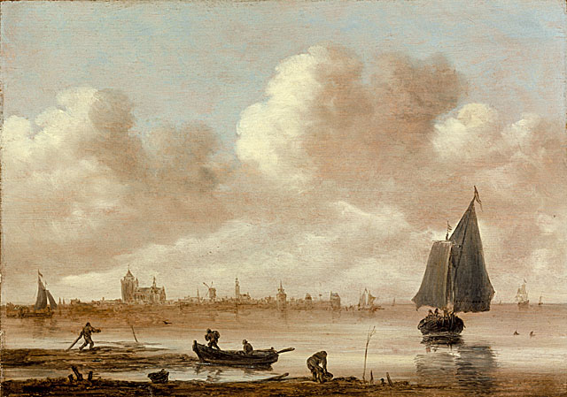
A prime example of this is the work of the Dutch 17th century landscape painter Van Goyen. Beginning with a rich warm ground tone, his work is essentially a balance of browns and greys, with occasional touches of muted color. With this palette he manages to suggest the full range of warm and cool tones in nature, and to create a work that vibrates with color. Because there is no strong color laid over it, the ground tone remains the dominant color note, fairly pulsing with warmth. The scene has the strong odor of fertile earth, mixed with the tangy salt of the ever present sea.
Van Goyen is unusual among his contemporaries for the severe limitation of his palette. Most were using the most vivid colors available to them, if not throughout the painting, then at least in key touches and accents. But none of them succeeds in being more vibrant than Van Goyen.
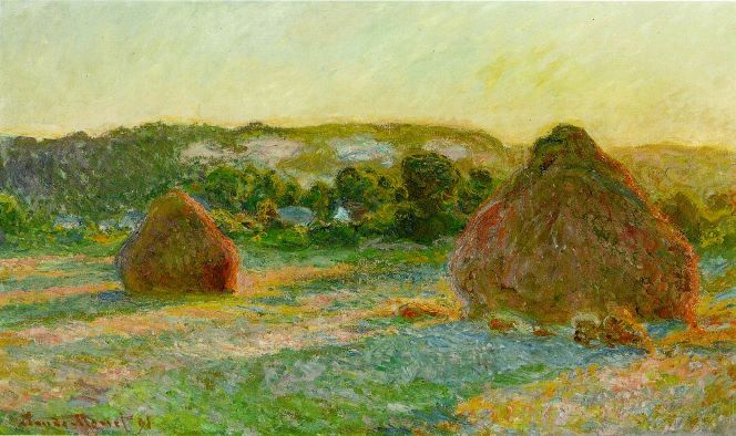
In an example by the 19th century landscape painter Monet we see the very reverse of Van Goyen’s approach. In his experimentation with the riotous range of new pigments that were becoming available, Monet discovered that one could use touches of the most intense color to represent the subtleties of the muted and intermixed colors of the natural world. In his famous “Haystacks” series, Monet has chosen a subject that is inherently neutral in color, but has found that he can use the full rainbow of colors to describe the components of that indefinite color. And better yet, the very neutrality of the color of the hay allows the colors of light and atmosphere to take on a greater importance. With his technique of juxtaposed intense dashes of color, Monet achieves a vibrancy that is entirely new.
The Monson Arts Council is a 501(c)3 non-profit organization whose mission is “To discover, promote and sustain an appreciation of and an involvement in art and culture in Monson.” It is run by a volunteer Board of Directors who serve three year terms, and who each year elect a slate of officers for the coming year.
Monson Arts Council
PO Box 306
Monson, MA 01057
©2024 Monson Arts Council
Privacy Policy
Wonderful article. Less can be more or the awakened eye can see color more vividly. Both applications can render a moment in time differently but sensitively and successfully.