Delacroix and the Impressionists
One of the cornerstones of the artistic revolution wrought by the impressionist painters of the late 19th century was the deliberate juxtaposition of complementary colors to create an intensity and vibration of color never previously achieved. The availability of new pigments played a significant part in this new color revolution, but an equally important part was the color experiments of the romantic painters earlier in the century, particularly Delacroix. The visual excitement of his paintings rests in great part on this juxtapositioning.
For those for whom the term is new, “complementary” refers to colors which are opposites on the color wheel; the primary pairs are red/green, blue/orange and yellow/purple. Because our perception of color is relative (that is, influenced by the context in which a color is seen) any color will seem more intense if seen in close proximity to its complement. In other words, a red is redder seen next to a green, and the green is likewise greener.
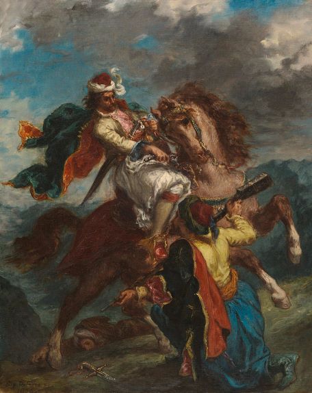
Though we can find examples of the juxtaposition of complementary colors before the 19th century, Delacroix seems to be the artist who first pursued their use in a conscious way, fully understanding the effect. His experimentation with color complementaries is seen particularly in his north African paintings: Arabs on horseback, Algerian women, the lion hunts.

Nowhere is it more fully explored than in his presentation piece, “the Death of Sardanapalus”. The painting as a whole is a riot of color, throbbing with warmth, but everywhere we seen that the warmth is heightened by the juxtaposition of green to red, blue to orange and purple to yellow. Coming out of an environment of cool neoclassical works which made up the academic tradition, such a work was a literal eye-opener to young artists looking for a new direction.
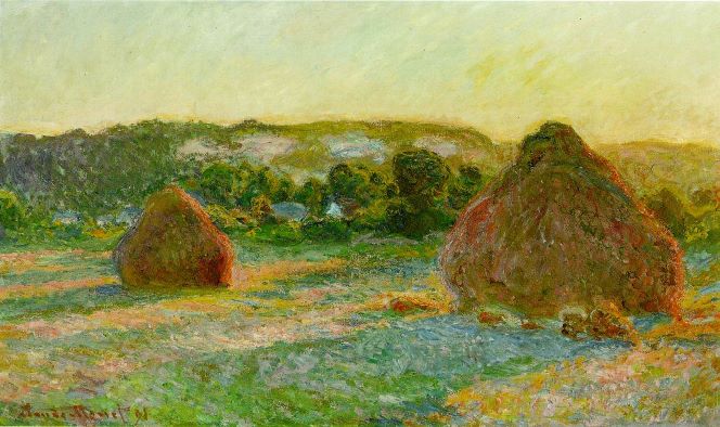
What the Impressionists did was to take the use of complementaries a step further, by breaking individual color areas into a visual field made up of complementary colors. The artist most responsible for this was Claude Monet, and an examination of almost any work after 1870 will reveal the close interweaving of complementary colors. The “Wheatstacks”, shown here, lets us see his technique up close, with all the colors unblended and pure. The result is a vibration of the visual field which takes us well beyond the intensity of the Delacroix.
The Monson Arts Council is a 501(c)3 non-profit organization whose mission is “To discover, promote and sustain an appreciation of and an involvement in art and culture in Monson.” It is run by a volunteer Board of Directors who serve three year terms, and who each year elect a slate of officers for the coming year.
Monson Arts Council
PO Box 306
Monson, MA 01057
©2024 Monson Arts Council
Privacy Policy